Turning a fragmented research process into a unified AI-powered workflow for corporate strategists.
Role
Lead Product Designer
Time Frame
Jan 2026 - Mar 2026
Team
Product Manager
Engineering Manager
Intelligence Analyst
4 Engineers
My role
End-to-end design (identifying problem through to implementation)
User interviews & Usability testing
Product Strategy
AI prototyping (Claude Code)
LLM output testing
Context
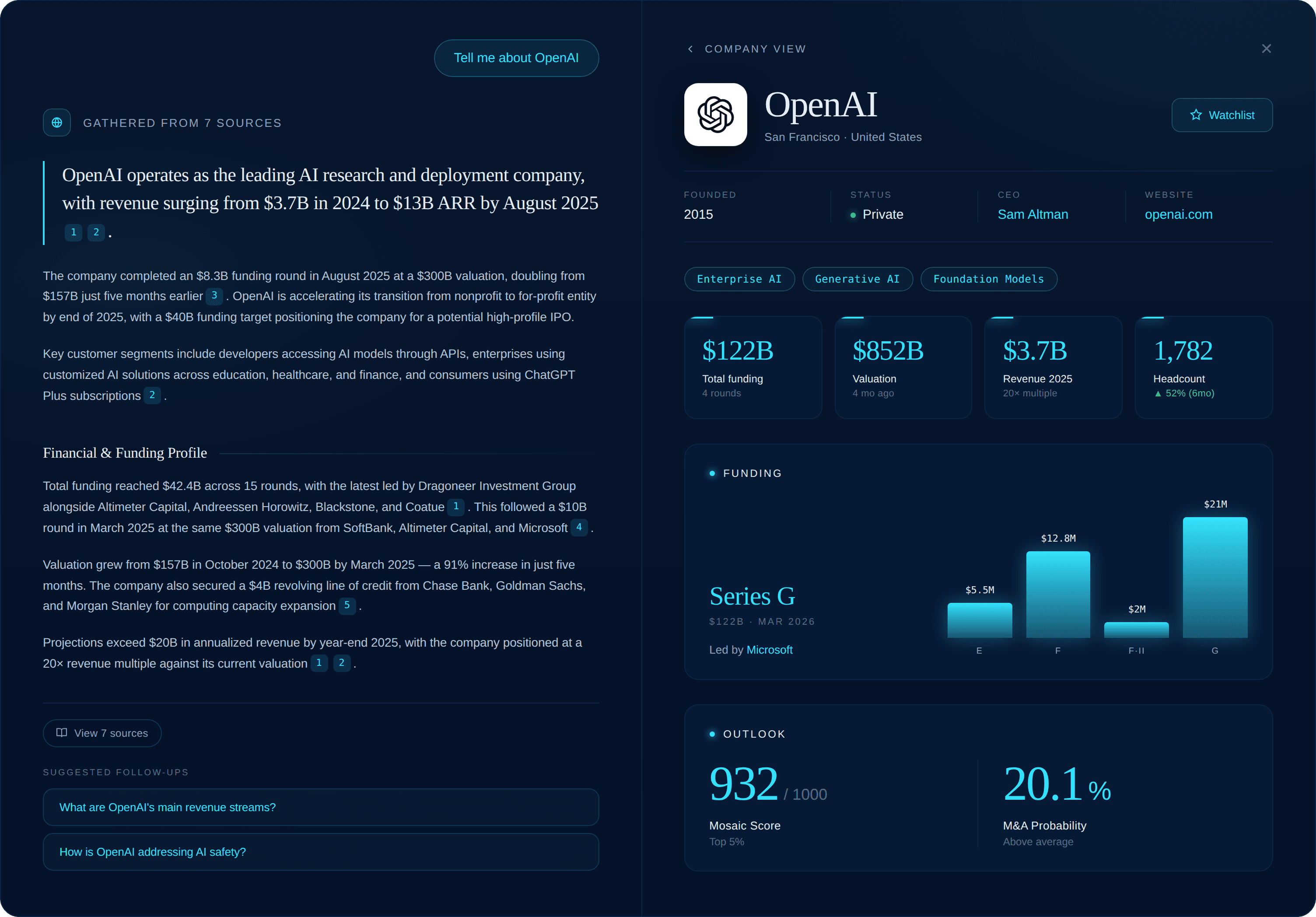
In late 2024, our team had built ChatCBI, a chatbot enabling users to interact with CB Insights data and research in natural language. It was very popular with a subsection of users. Hallucination rates were low, answers were well-sourced, week-over-week retention was 50%, and adopters were 2x more likely to become platform power users.
However, the tool lacked strategic focus. It focused on all of our jobs-to-be-done at once without facilitating them adequately. This case study covers how we evolved ChatCBI from a generic chat surface into a focused research tool. It consolidated sourcing and screening workflows that had previously been very fragmented.
The Users
Our primary users were corporate strategists focused on evaluating private technology companies. Specifically, CB Insights helped them find and evaluate these companies in order to inform an acquisition, partnership, or competitive response decisions.
Getting insight into private companies is very difficult. Standardized data is hard to come by, so the process requires a lot of research to get a clear picture. CB Insights had one of the most comprehensive databases for private companies and a dedicated intelligence team to make sense of it. It helped. But our platform's navigation was complex, and users still had to do a lot of research and synthesis themselves.
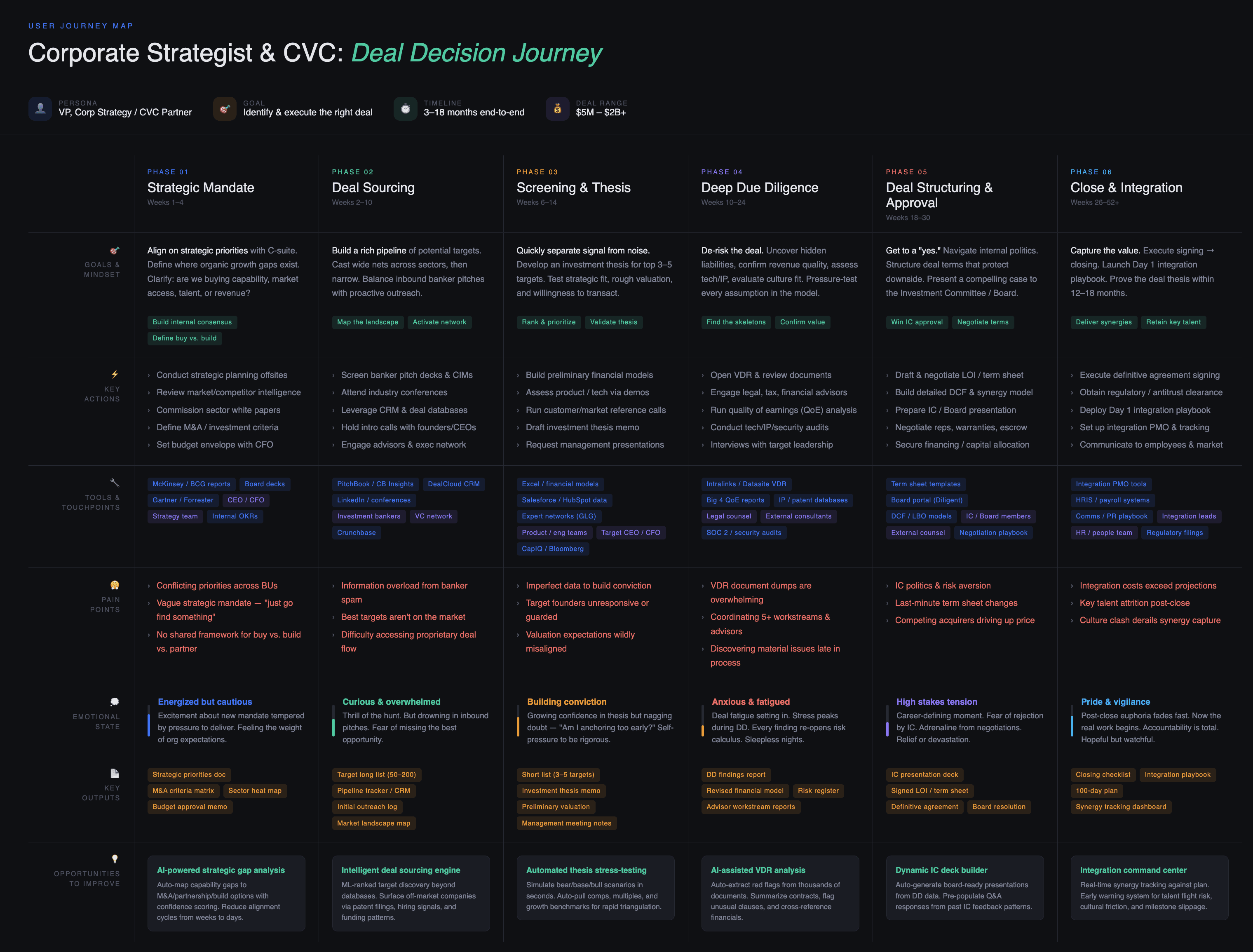
The sourcing and screening process was particularly intensive. It required strategists to put together a long list of companies that could fit their thesis, usually running from 30-100 companies. Then they had to assess each of them and create a short list of the companies that could be a strategic fit.
The Problem
The process was incredibly fragmented. Getting a full view of a company was not a one-stop process. It required investigating investor websites, company websites, news coverage, our platform, competing platforms, and most of the time, just straight up Googling. Then copying+pasting into a spreadsheet and validating all the data that had been gathered. Rinse and repeat for 100 companies, and piece together a deliverable. It was chaotic.
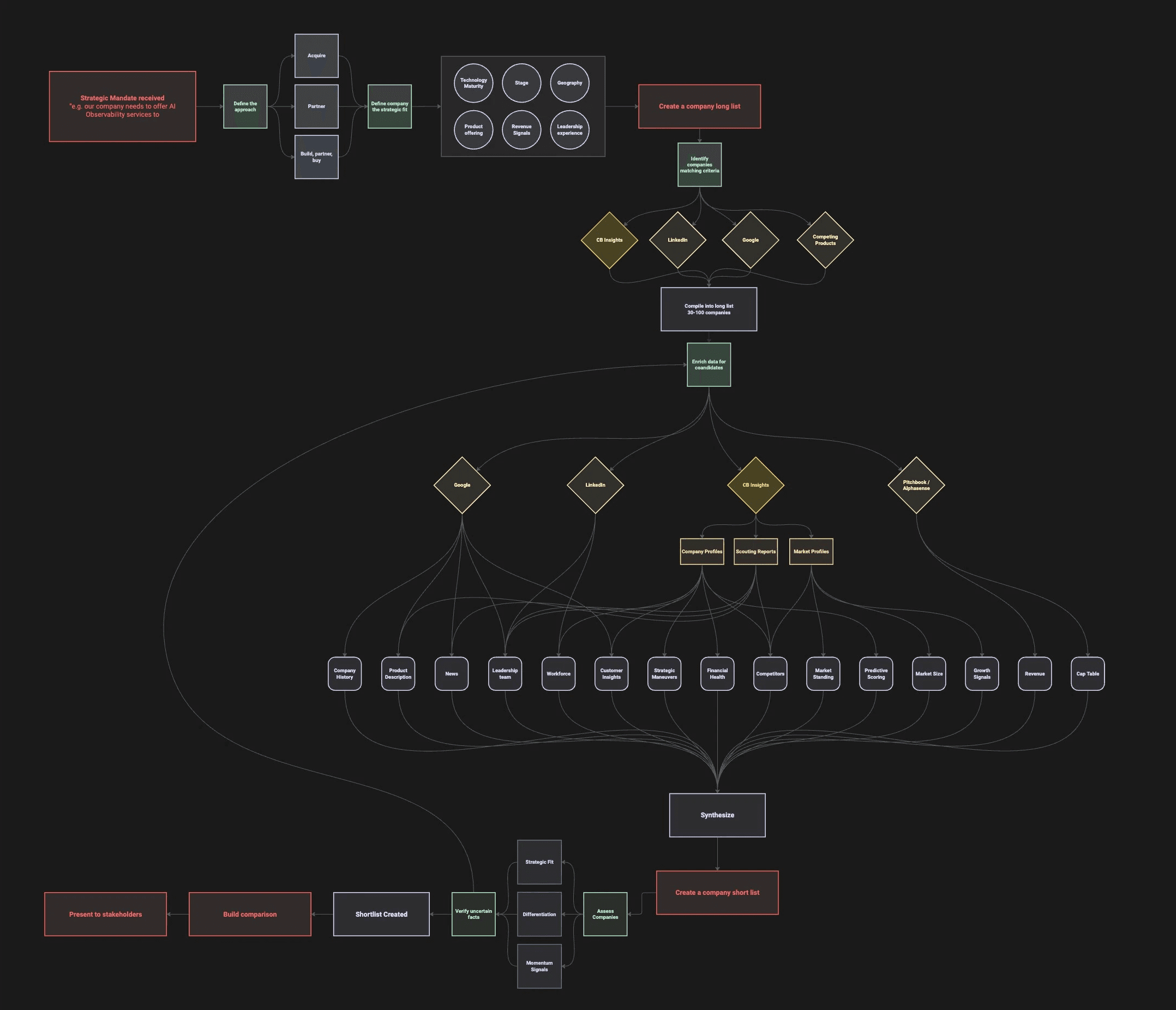
A very simplified version of the build/partner/buy process.
ChatCBI had succeeded because it alleviated this process. Instead of navigating our complex search, profiles, markets, and research separately, users could now just type their question into ChatCBI. But the answers were rarely complete and often required further investigation. If you needed to dig deeper on a specific topic, you would open up a source into another tab. The process started fragmenting again.
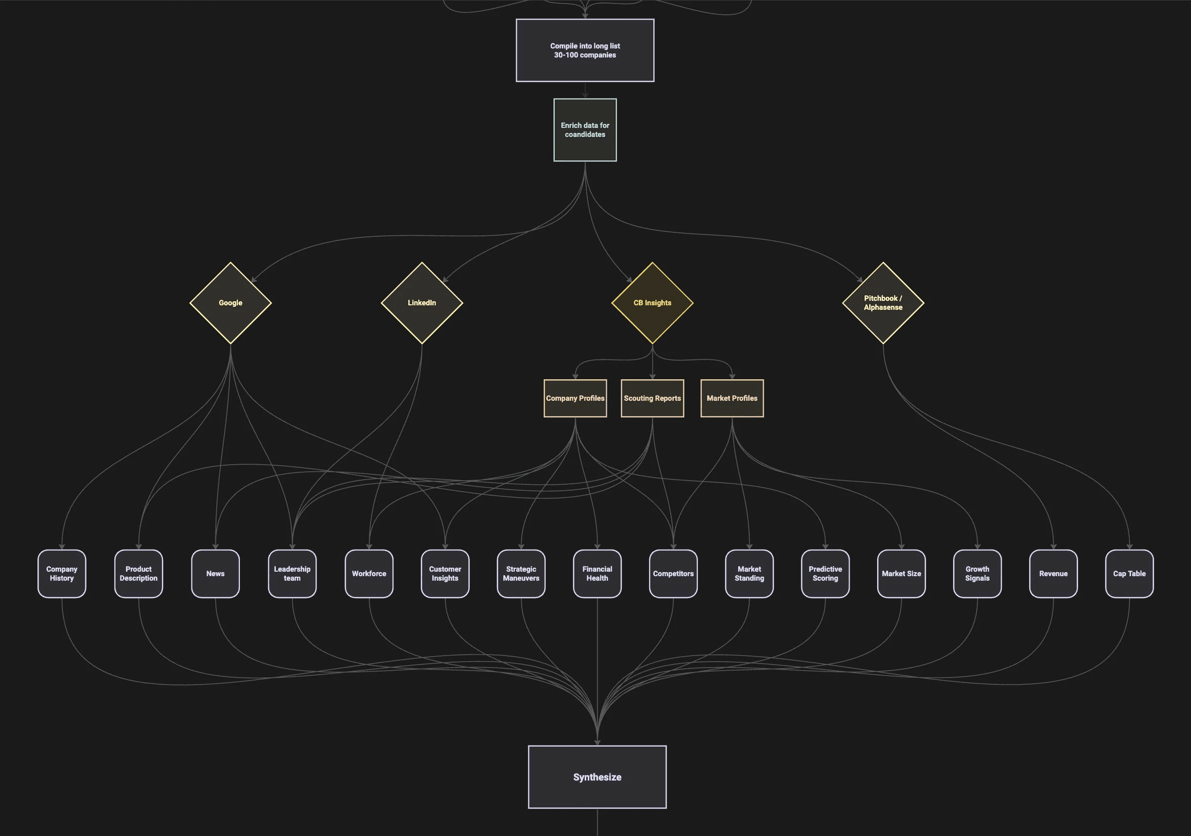
The portion we wanted to simplify.
We knew that we wanted to break down this fragmentation into a more focused flow, but first we had to investigate the issue further.
Research
We approached the problem from two angles:
User Interviews
Since launching ChatCBI, we had continually talked to users whenever we had the chance. In a year, we talked to over 50 people, some of them repeatedly. These are the sentiments from those conversations that informed this project:
Workflow Fracturing
"I don't want to leave ChatCBI. … The answers are well sourced and reliable, but if I need to investigate any details further it takes me to another tab and it requires so much extra work."
- Manager, CVC @ Prominent Manufacturing Company
Validation Sentiment
"I'm still going to sanity-check the results that your Al is giving me. That's just part of diligence and that's not going away. But the time savings would really happen if a) I knew you were getting your information from [a good source] or b) if you can streamline my flow by anticipating where I'll be clicking to validate your insights."
- Corporate Strategist @ Fortune 500 company
Limited Lists
"Why am I only getting 10 companies per answer when I'm asking for all the companies in [a space]."
- Analyst @ Healthcare Research Company
Analyzing User Queries
To verify our assumptions, we first wanted to solidify our understanding of what ChatCBI was being used for. We anonymized and analyzed a set of queries for the past 3 months. In collaboration with an analyst, we tagged 500 conversations and consolidated until we had a tight set. These were the top five use cases:
#1 Feature - 37%
Company Sourcing
Identifying companies that match a set of criteria.
#2 Feature - 25%
Company Analysis
Deep analysis on a single company.
#3 Feature - 14%
Market Trends
Investigating a market, its players and trends.
#4 Feature - 12%
Deal Activity
Understand where deal activity is trending and who is active.
#5 Feature - 8%
Competitive Benchmarking
Monitoring competitor activity.
About 37% of queries fell into the Company Sourcing use case. However, on further investigation we found that it had the highest abandonment rates (~70%). While other use cases hovered between 30-40%. We deduced from analyzing the responses that this came down to the shortcomings of the LLM. It rarely provided more than 10-15 companies, even when the user asked for complete universes. The answer hinged entirely on those companies being correct.
We seemed to be doing much better with the Company Analysis (25%) and Market Trends (14%), where the depth of conversation generally went much deeper. However, here too fragmentation and validation was still a major problem.
Next Steps
Given that the top two use cases on the platform made up 62% of conversations in ChatCBI, we opted to focus in on those, and how to reduce the fragmentation of those flows.
Strategic Decisions
First, two strategic decisions had to be resolved before we could start designing.
Decision 1
Should Chat be the platform or should AI integrate into the platform?
This was the foundational question we had gone back and forth with leadership on for months. My position was that we needed to invest into build functionality into existing features and/or invest in new features around the platform. For several reasons:
ChatCBI didn't have its own information architecture. There was no logical place for users to go for certain functionalities, just a series of chats.
Artifacts created in the chat didn't have a specific space to live, and would live across chats.
Only 40% of active users had adopted ChatCBI, so there would be a limited audience for features built there.
Features developed in ChatCBI would only be available there, and would need to be reverse engineered back into the platform. Whereas building AI functionality into the existing platform would be easier for the chat to pick up and utilize.
The counter argument was that building everything inside ChatCBI would:
Be easier from an implementation perspective.
Provide more freedom to adapt the UI into what would work in chat workflows.
It would, theoretically, streamline the process and keep everything in one place.
Leadership felt very invested in ChatCBI as the future of the product, and after several rounds of discussion the direction was clear: chat would be the center of the platform, and we would not be investing in the existing platform features in parallel. We tried to make our case across multiple discussions, and it didn't change their position, so we committed to the direction.
Decision 2
Should we invest in deep linking into our internal sources?
Deep linking into our content would allow us to point users to the exact paragraph a claim was made from. Instead of just the page the content was sourced from. It would make validation of claims made much easier. But our existing infrastructure didn't support it, and building it from scratch would require significant resourcing from multiple teams.
Earlier we had explored another alternative to deep linking. We had the AI cross-check it's own claims against the source contents. It assigned claims to sources and then flagged which needed more analysis and which had no basis in the source. Internal testing was promising and alpha customers liked it. But as we got more use we started seeing hallucination in the assessments as well as the source excerpts themselves. So we had to shut it down.

After weighing the risk to the timeline, we opted to look for other ways help users investigate sources. This left us one primary direction, which was to bring the most relevant source data into the chat.
Mapping out the Process
At that point we knew a few things:
In order to reduce screen and tab fragmentation, we needed to make source contents available in ChatCBI.
To improve the sourcing of companies in ChatCBI we needed to expand its search capabilities. The chat was able to run a search with a few basic filters, but the results were too broad. We needed expand to all filters to narrow down useable list of companies.
To make a tangible artifact that users could analyze, we needed to allow users to save companies to their watchlist.
If we could bring watchlists into the chat we would enable the user to run bulk analysis on the companies they had chosen while continuing their work.
When it was all on paper, we saw the pieces needed to build a sourcing flow. Getting a user to a shortlist of potential companies in a single process. Through a discussion with our trio, I mapped out what this flow could look like.
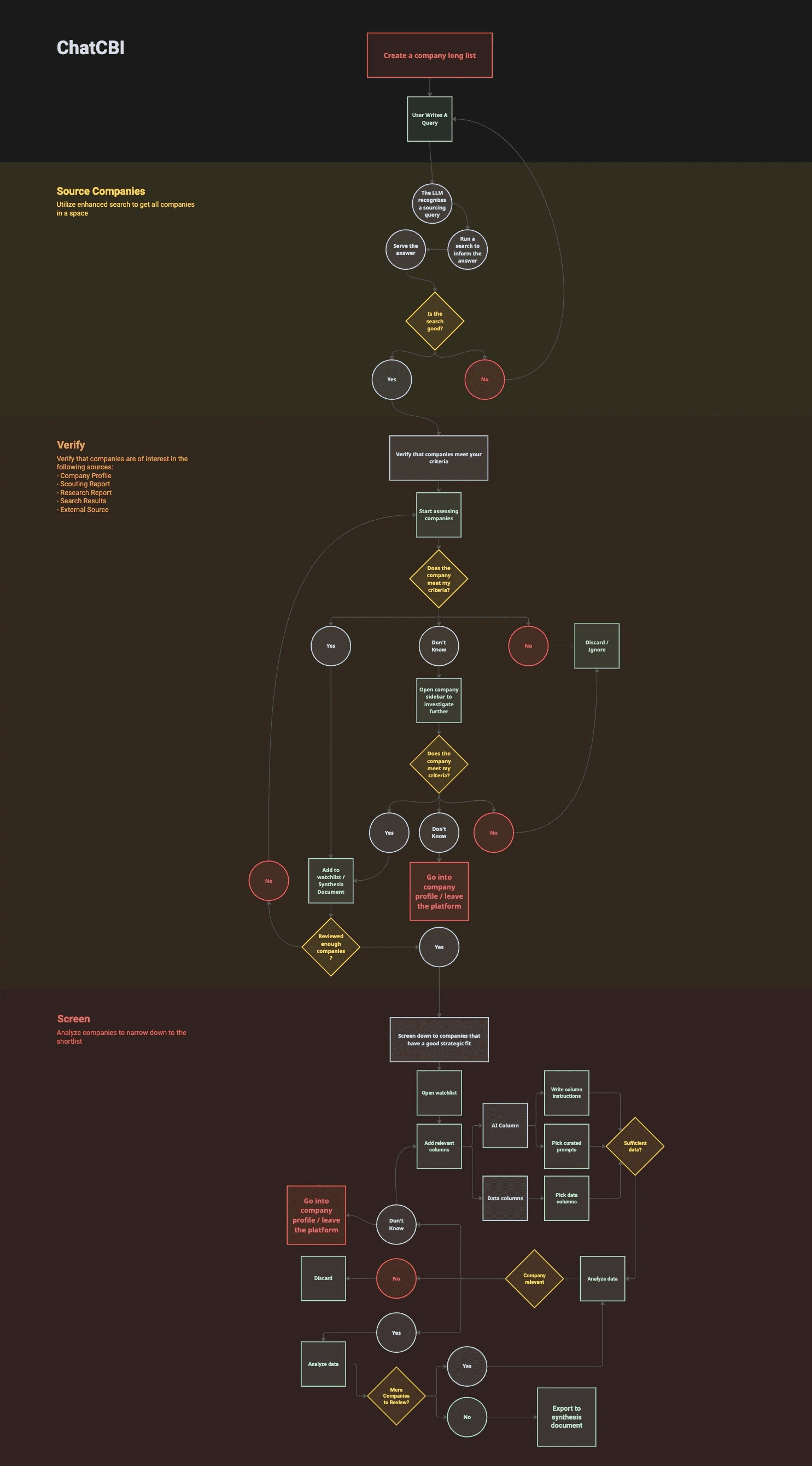
Leadership was excited about the direction and we had no trouble selling the path forward. We agreed on laying the core of the development out in 3 sprints:
Sprint 1: Verify
Focus on letting users verify sources without leaving ChatCBI.
Sprint 2: Source
Improve search to provide a better list of companies for users.
Sprint 3: Screen
Allow users to access their lists in ChatCBI to run deeper analysis.
Sprint 1: Verify
Goal: Let users investigate sources without leaving ChatCBI.
Which sources to focus on
A quick query showed that three source types accounted for most of our citations:
Company Profiles
Scouting Reports
Research Reports
Scouting Reports already had sidebar UI we could refresh, and Research could pull directly from our CMS. Company Profiles were the heaviest lift and the highest stakes.
UI Cleanup
Knowing that we were going to be adding more elements to the interface we first needed to clean up what we had.
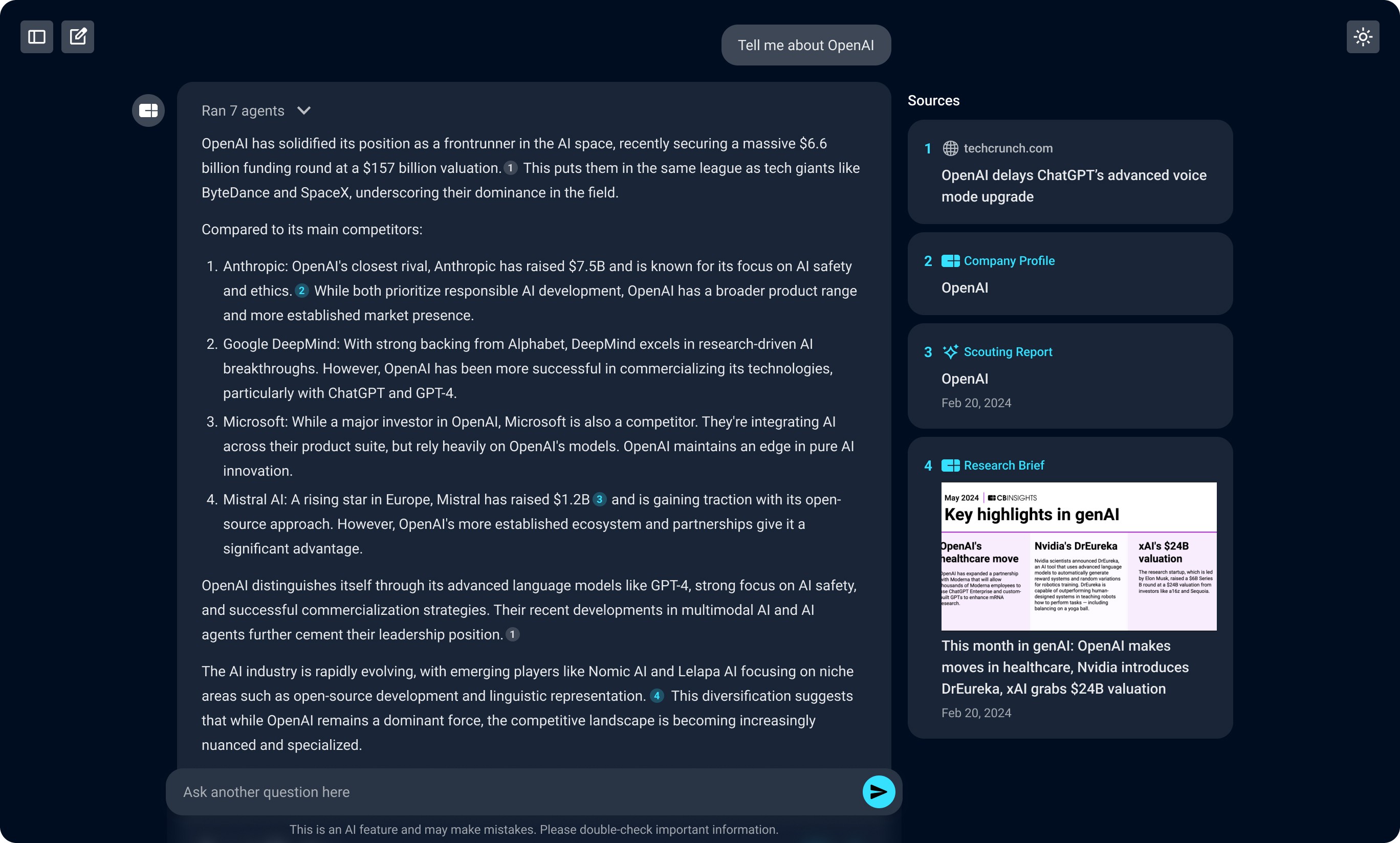
The UI before simplification.
We hid the sticky source bar on the right side to reclaim space. Then removed the chat bubble to make it easier to insert content into the answer.
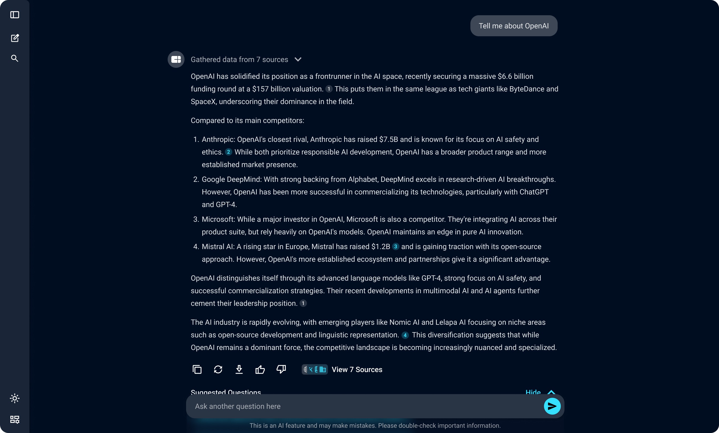
The UI after simplification.
New UI vs Existing UI
It would make the most sense to use the existing UI of the platform to create these capabilities. Two things ruled that out:
Most of the platform wasn't responsive. At 1280px (~15% of users) and 1440px (~45% of users), the page didn't adapt cleanly into a split view.
The platform didn't support dark mode. ChatCBI was centered around dark mode, and dropping light-mode UI into a dark chat would have been jarring.
Fixing either problem would have required pulling other teams off their roadmap. So we built new UI for the chat.
Form Factor
I prototyped three options in Claude Code to test how source investigation felt against a real conversation:
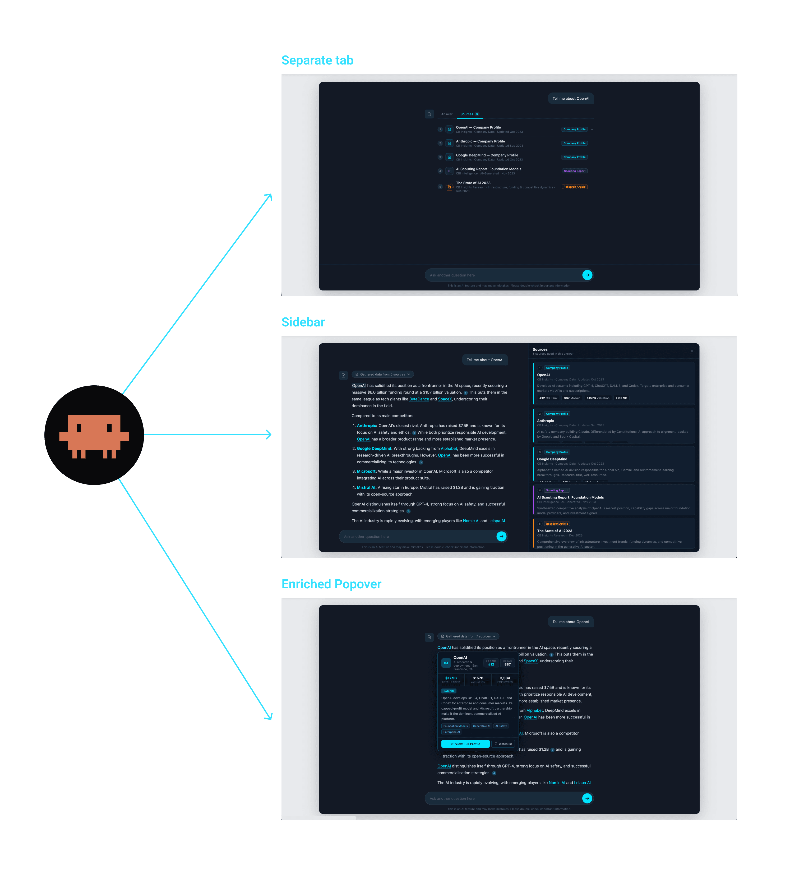
We very quickly cut the tabbed option. The flipping back and forth between options was the exact friction we were trying to remove.
The popover was good for quick context on a single citation without disrupting reading flow. While the sidebar worked well for cross-referencing while reading the answer. They served different moments in the same workflow and shared most of their underlying data, so we decided to build both.
Sidebar Size
After testing against our most common screen sizes we landed at a 45% width. It was wide enough for source contents and narrow enough to keep answers readable.
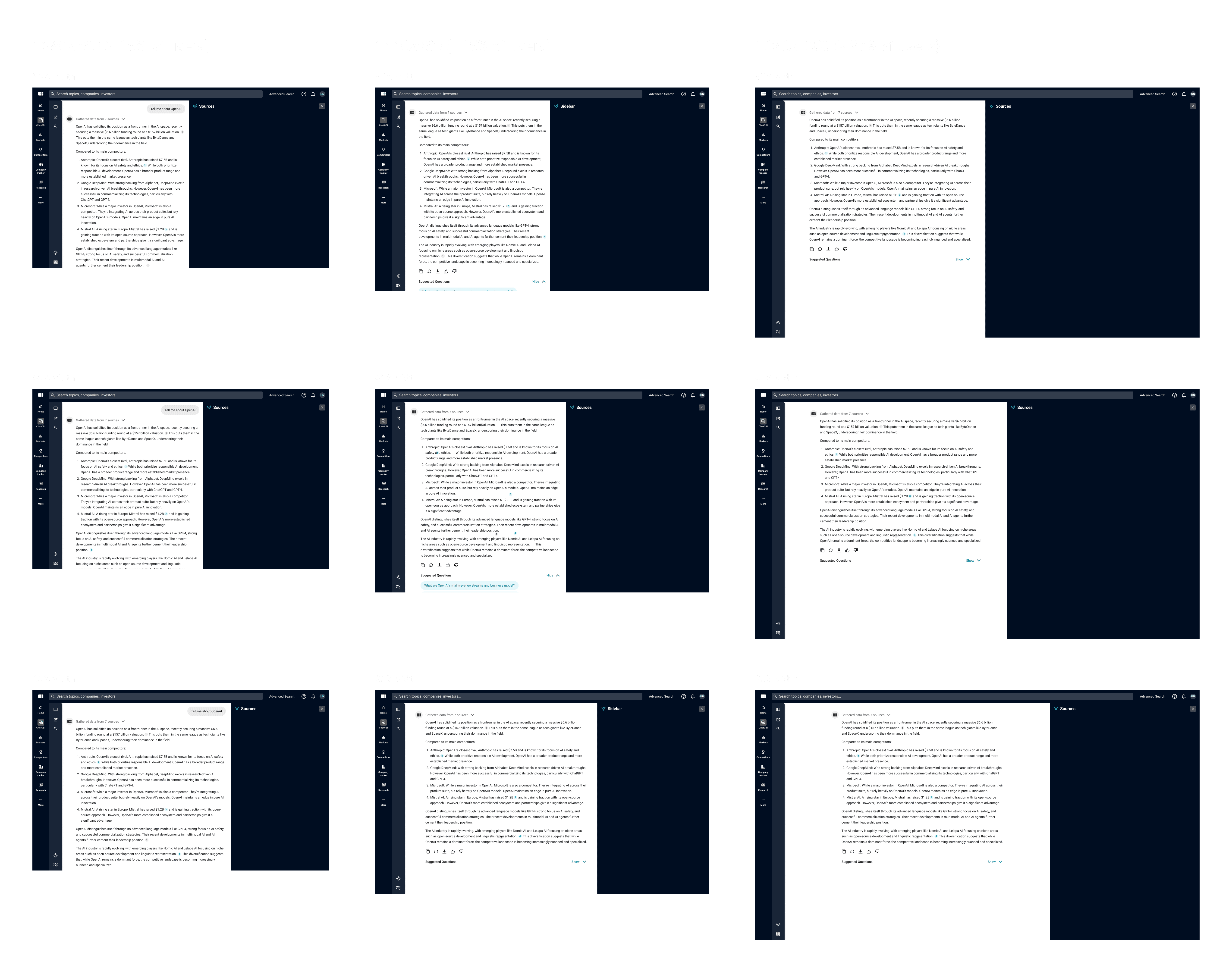
Note: I made the answer light mode to make the space taken by the sidebar more apparent.
Designing the three sidebars
Scouting Reports and Research
These were easiest. We gave the Scouting Report sidebar a visual update and it could serve as a container for both content types.
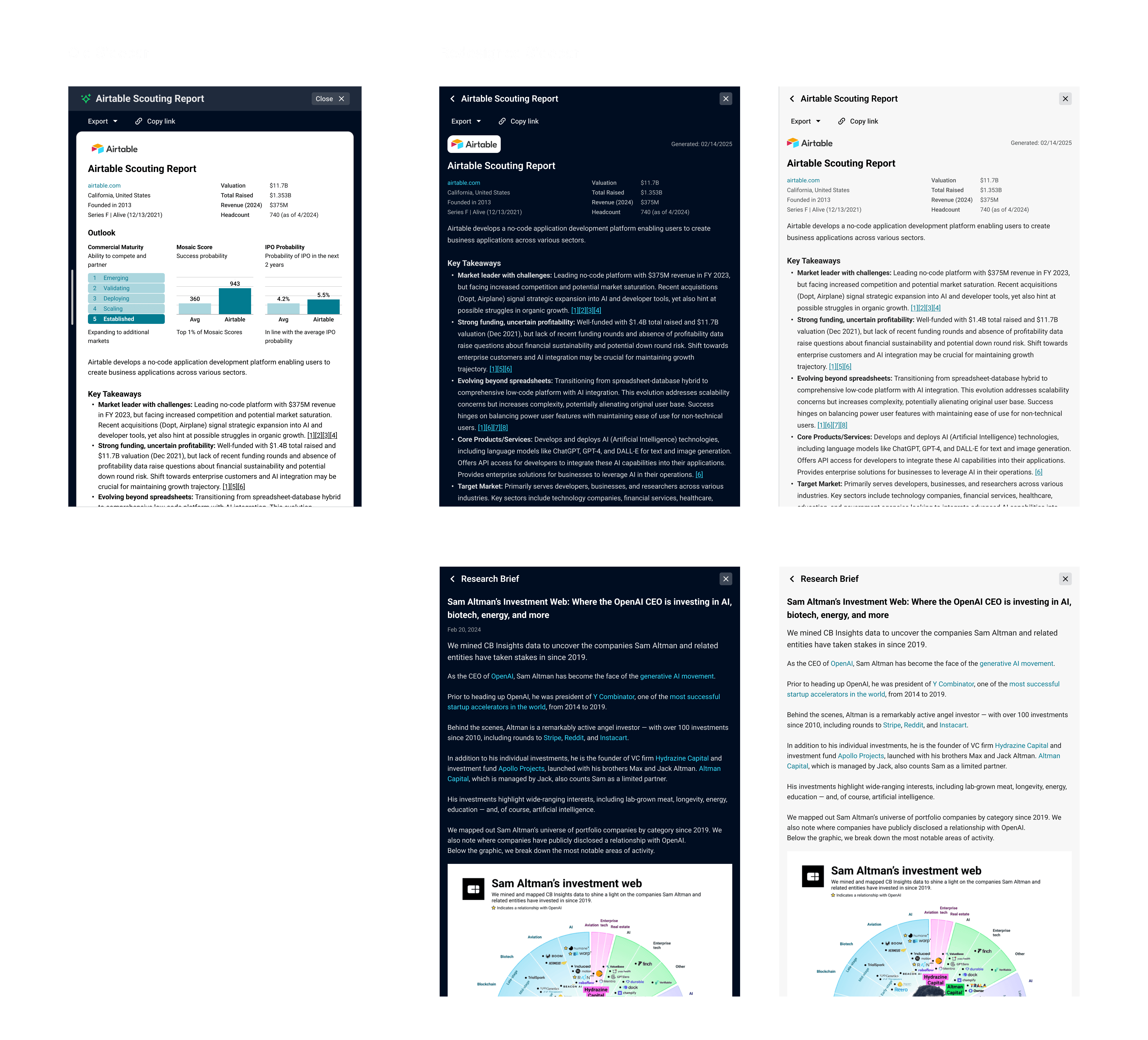
Company Sidebar
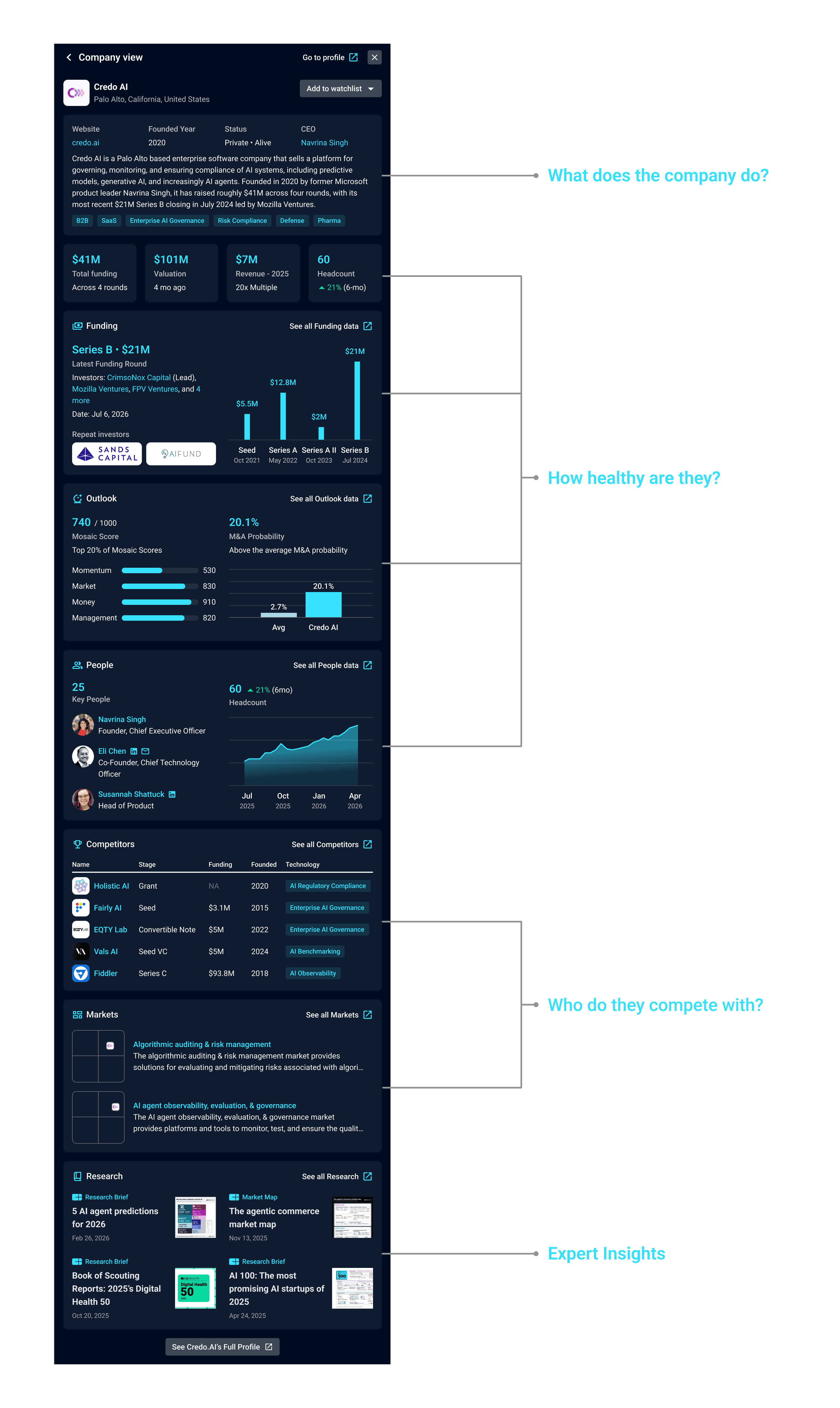
The Company Sidebar needed to summarize key points about the company, and allow the user to determine if the company was of interest. Our many conversations with strategists had told us that they focused on three questions when initially assessing a company:
What does the company do? (Product, industry, business model)
How healthy are they? (Financials, Headcount & Predictive Score)
Who do they compete with?
I gave Claude Code screenshots of the company profile and our chat UI. Then some context around the user workflow to start producing ideas

For the optimized version it was clear I was not specific enough in my question, and the model invented datapoints that didn't exist. It still provided some useful ideas for how to structure the sidebar.
The explorations helped give me some pretty clear ideas of how to lay out the contents, and I now had to match that to the design of ChatCBI. Resulting in the following:
Source Preview
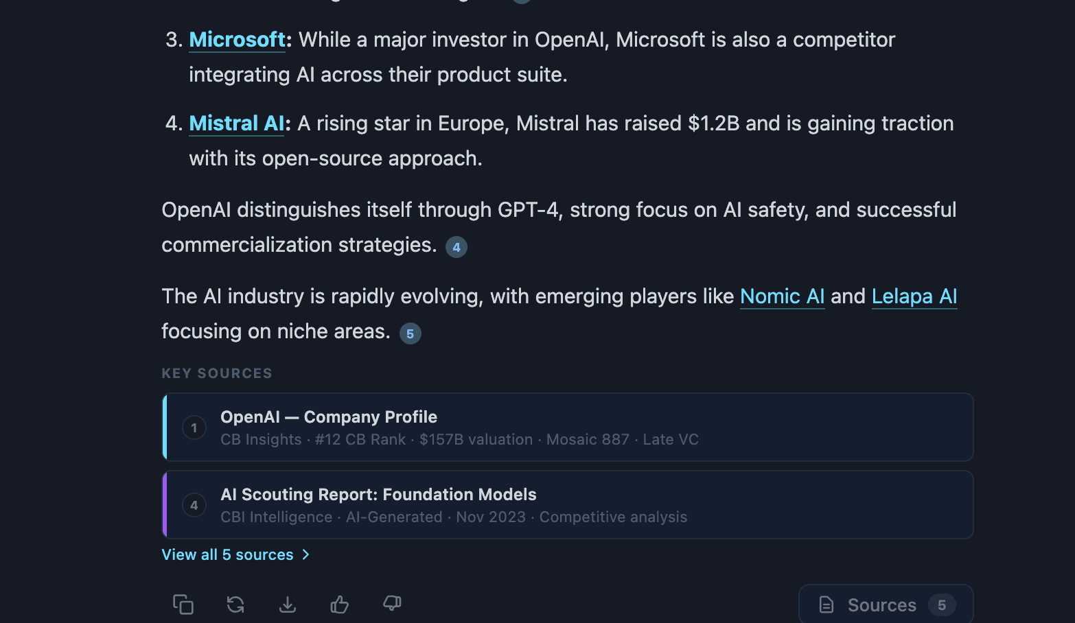
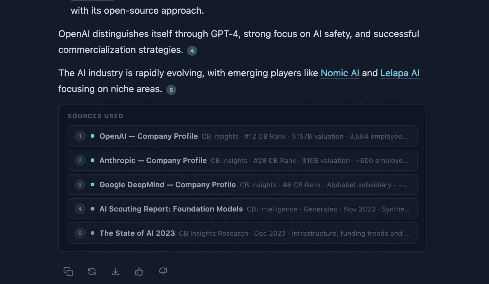
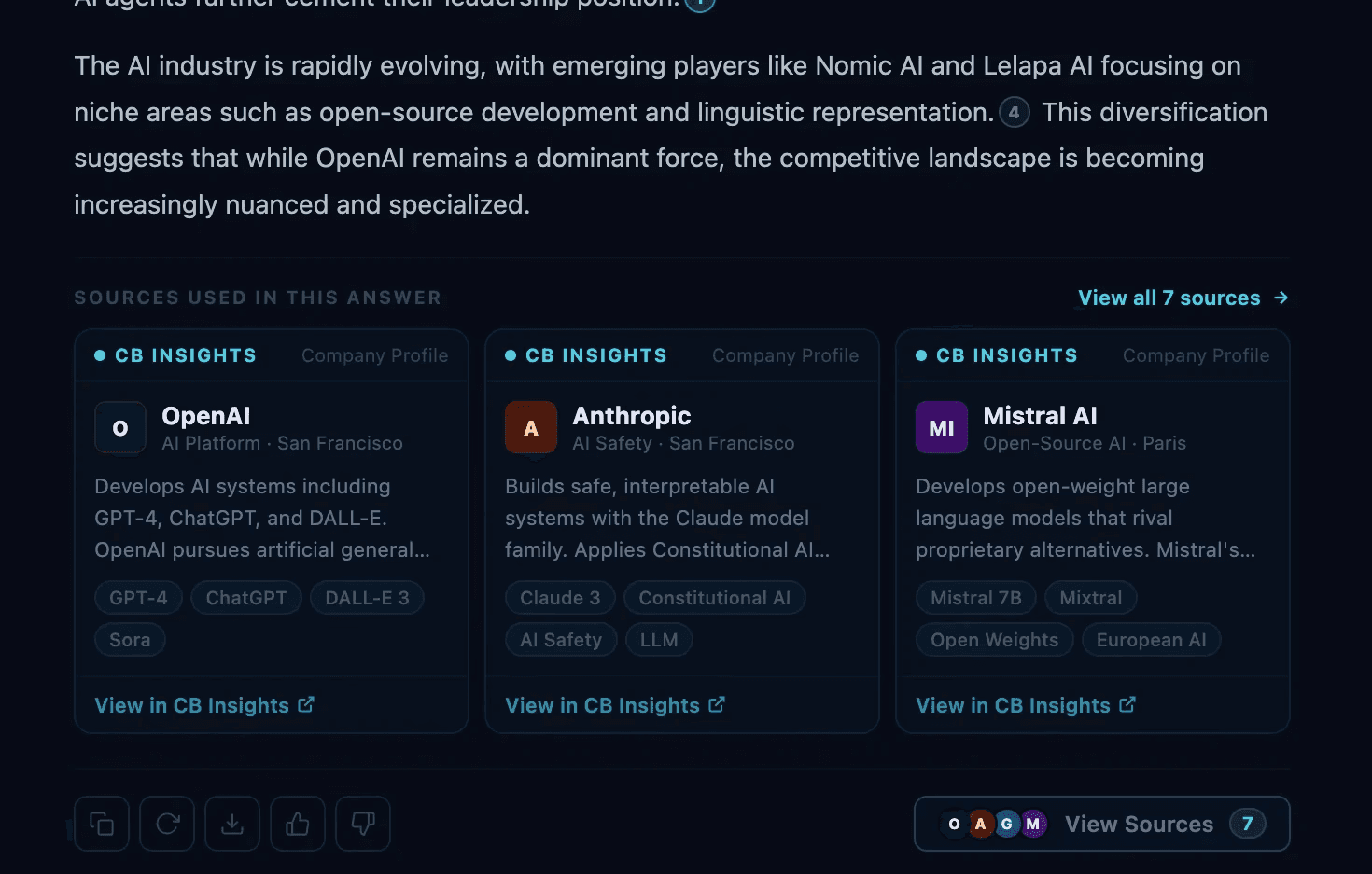
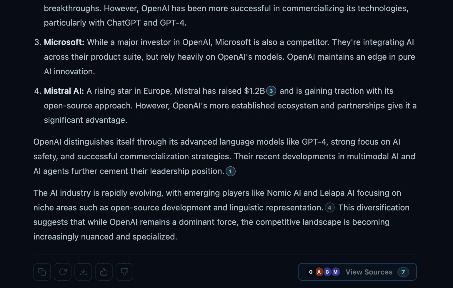
Since we had removed the source cards from the chat view, there was some worry that our main selling point was being buried visually. So we explored a few different options for showing a preview of the sources in the response. Ultimately we decided that we were building for a perceived problem instead of an observed problem, and opted to start with a button at the bottom of the response to open the sidebar.
Source Card Improvements
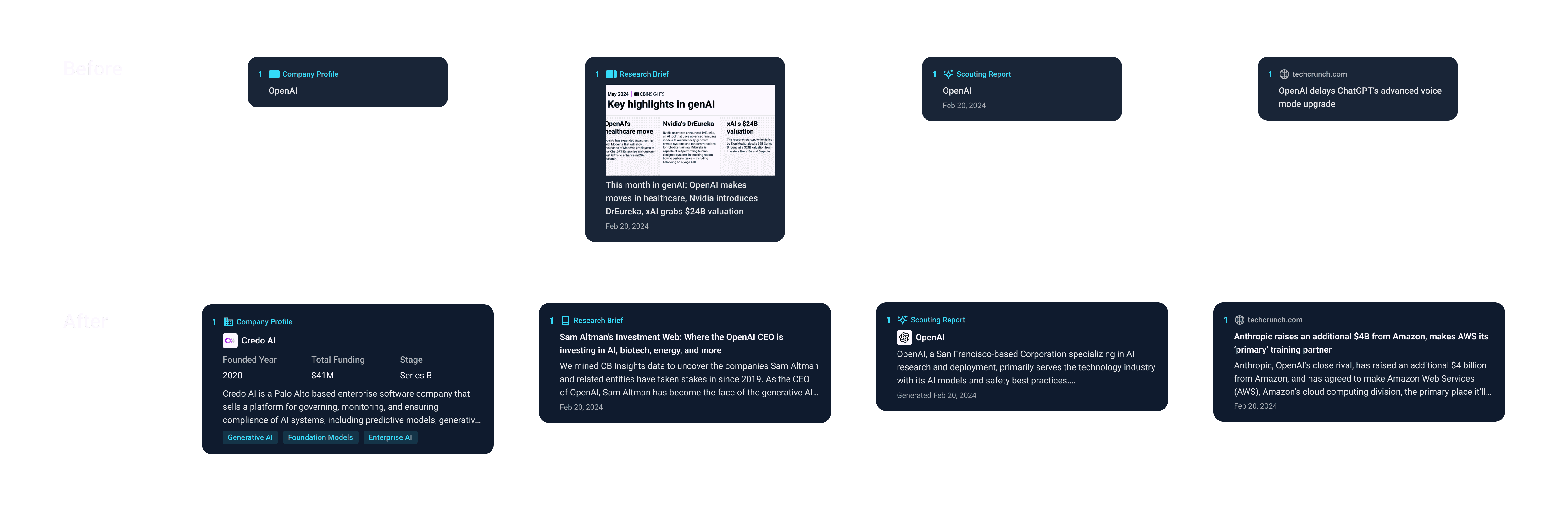
We also took the opportunity to do some much needed work on the source and popover cards. They had just contained a source type and headline, but we now were able to enrich the sources with the relevant data the user needed.
Final Designs
Below is a snapshot of what we were able to deliver to customers.

Sprint 2: Source
Goal: Fix the 70% abandonment rate on sourcing questions.
The query analysis had pointed at a clear cause: the LLM capped responses at 10–15 companies even when users asked for entire universes. Engineering was already expanding ChatCBI's search to use the full set of Search filters, sorting, and boolean queries. Often going beyond what a power user would build manually. The design question was how we could integrate the search data in a useful way.
LLM response or Search Results?
The two paths had some tradeoffs.
The LLM response had better judgement. It gave custom analysis tied to the users' question and read like a recommendation. But it capped at 10–15 results and left hallucination risk open.
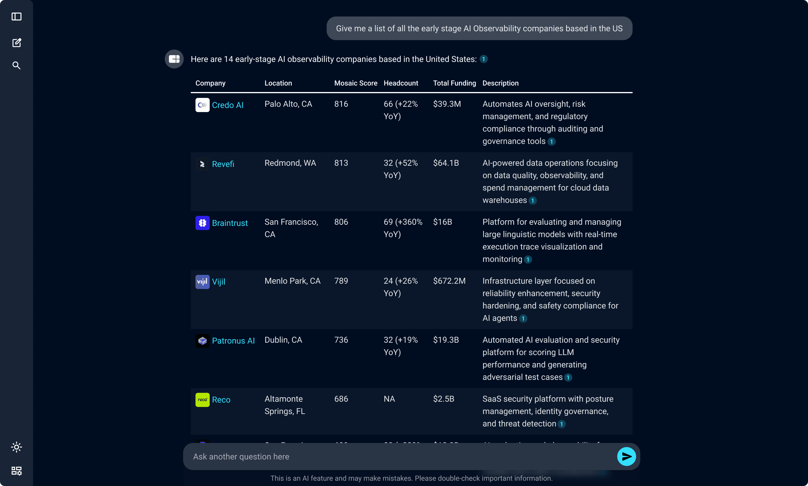
An LLM only response.
The Search returned exhaustive, real data. It could return anywhere from 1 to 10,000s of companies. But it didn't apply any level of reasoning, so often the search results would be a downgrade from the LLM responses and risked introducing more noise in the UI.
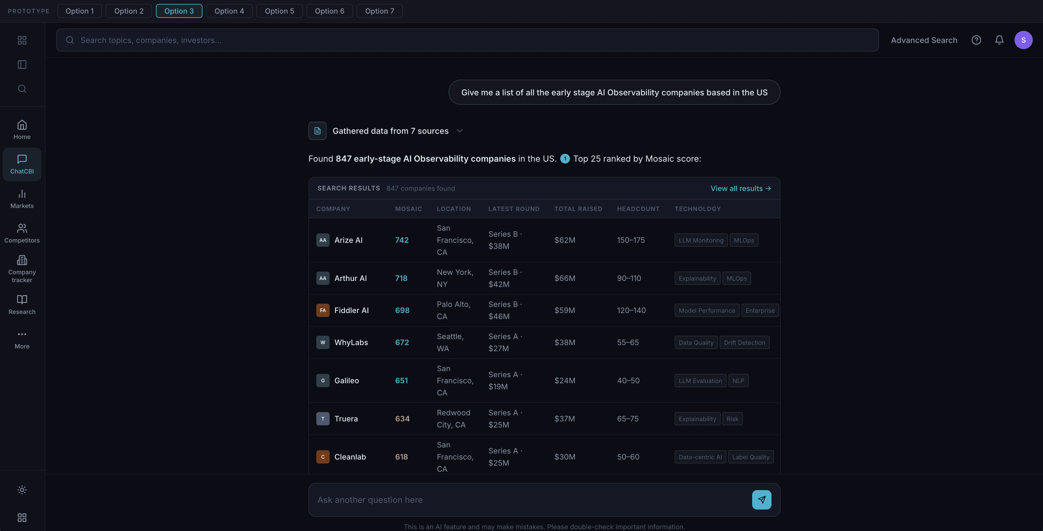
A prototype exploring centering on a search result.
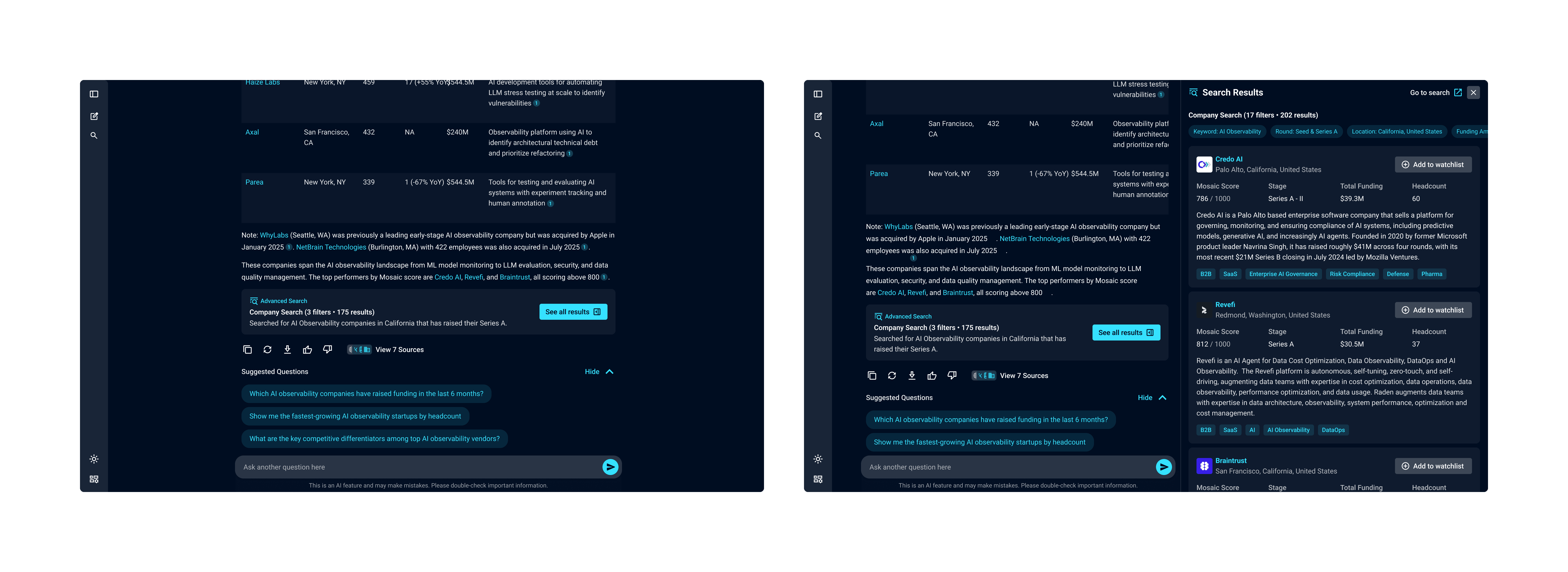
Picking one meant accepting the other's weakness. So we anchored on both: the LLM response led with custom analysis and a clear path into the full search results would sit beneath it. The LLM gave users a reasoned starting point, and the search gave them somewhere to go when they wanted the full universe.
Designing the Search Result view
Once we'd decided to show search inside the chat, the next question was how dense to make it.
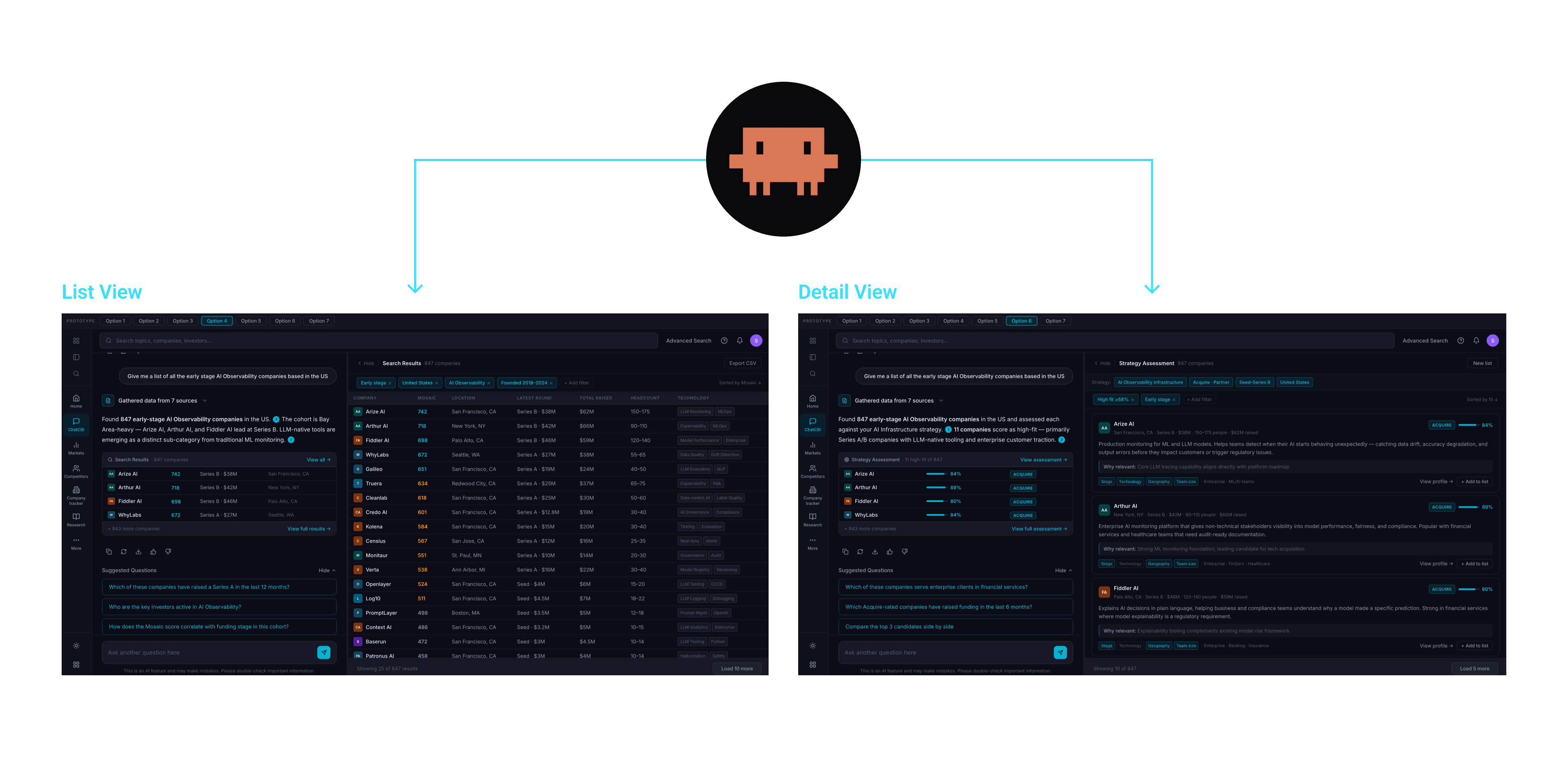
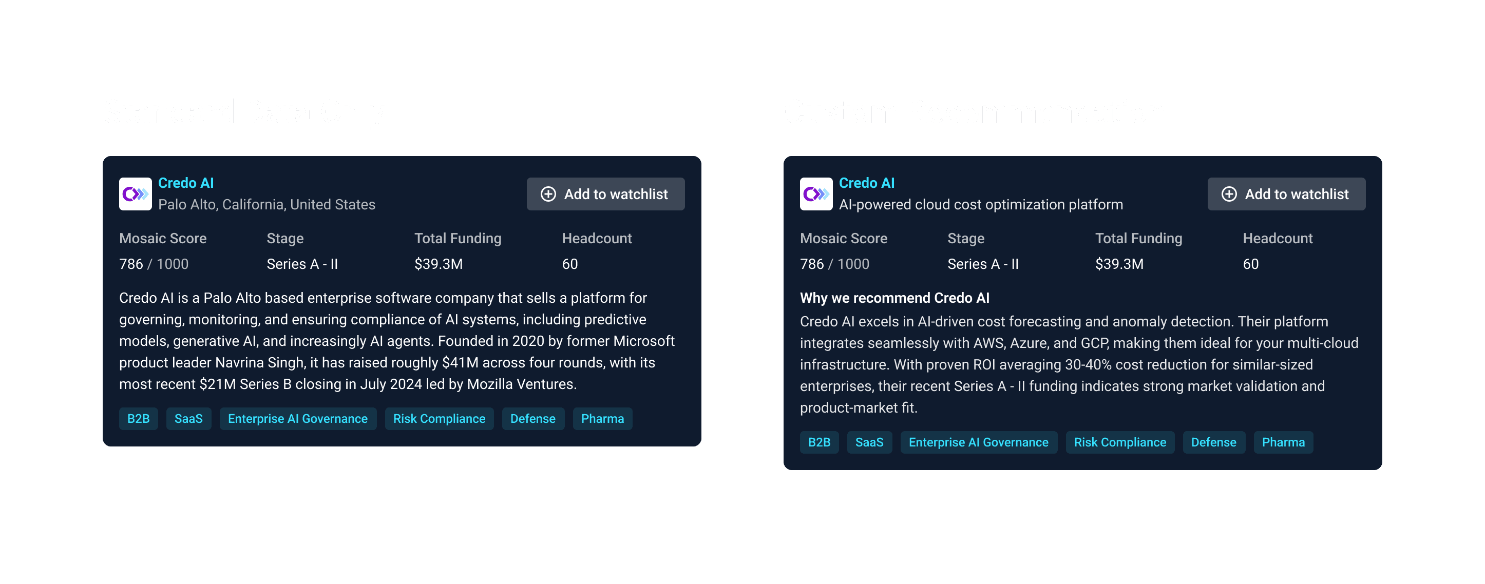
Detail view over list view
The data table would have put more companies on screen, but the job-to-be-done was about determining which company was worth a closer look. Not data density.
The detail view would put the datapoints most relevant to that decision, so users could assess the companies without leaving the chat.
Stock descriptions over custom recommendations
If we wanted to go the extra mile for users, we could generate an AI recommendation on why the company might be of interest. We would generally have enough user and conversation context to base that off.
It would ultimately have been a better experience, but it also meant racking up costs and load times. Searches could have 10,000 companies, and they could be run multiple times. So we stayed with the existing descriptions and kept custom analysis for the chat response.
Inline Block
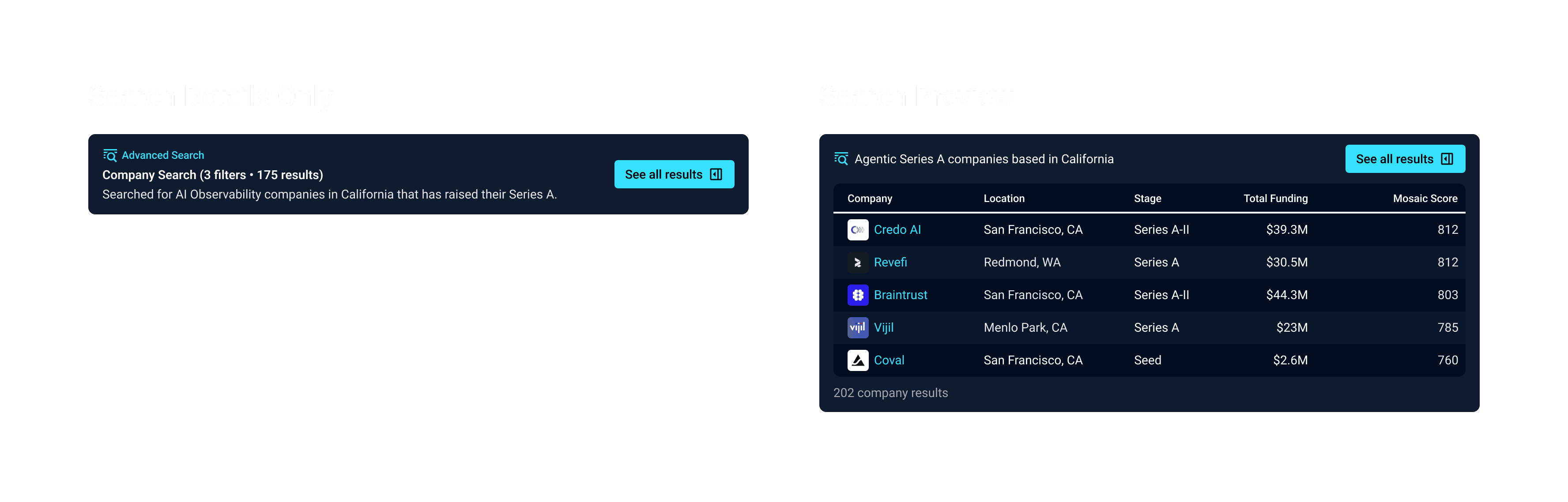
Next we had to figure out how we would present the search in the answer itself. The key question was: do we preview search results in the answer or only focus on the details of the search? A preview would be a great affordance for what they could expect in the sidebar, but since we opted for a detail view that expectation wouldn't be met.
Automated shortlisting
We discussed with the engineering team whether there would be ways for the LLM to run analysis on the entire search result, and flag companies of interest. However, this could cost as much as $10 per analysis in LLM costs. It would have been a huge value add, but the costs would be so high that we would have to pass it onto users. That was not at all viable, so we tabled it.
Discoverability
To make the new capability findable, we added a Company Sourcing expert use case. This was a path with prompting tuned for sourcing questions and search recommendations. That made the new functionality discoverable without requiring users to guess how to best phrase a sourcing question.
Final Design
For the final design we delivered the following:
Sprint 3: Cancelled
Due to changes in strategy across the company, the third sprint ended up being deprioritized. Instead of continuing to build out the UI of our chat Leadership wanted to focus on MCP and inserting CB Insights data into existing LLM workflows. This put the work we did on hold. We did start exploring the direction from a design perspective, but were never able to dig into how we could automate some of the tedious parts of the screening process, like:
Automated column setup: Using chat context to pre-configure list columns based on what the user had been researching.
Sourcing templates: Turning successful sourcing flows into reusable patterns.
Screening suggestions: Surfacing companies worth deeper analysis based on the criteria established earlier in the conversation.
Testing
We were not able to usability test the features directly with end clients due to the short timelines. However, there were a few assumptions that we were looking to test:
Do users still notice the sourcing even if it's behind a button click?
Are users are able to access the sources intuitively?
Do we have the most important data available in the company sidebar?
Do users understand how to dive into the underlying company/scouting report/research pages if needed?
Is the search inline block helpful?
Are the search results high quality enough to be useful as more than as a source?
Is the search detail view succeeding in recommending companies? Or just friction for seeing the list?
Result
The redesign shipped in two of the three planned sprints before company strategy shifted toward MCP integrations. In the four weeks of post-launch data we captured:
Sourcing abandonment dropped from 70% to 40%: the clearest signal that the expanded search and richer company sidebar were doing their job.
Adoption rose from 40% to 45% of active users.
Active user count grew 10%, with retention holding steady at 45–50%.
No significant change in conversation depth, suggesting the verify and source workflows were working as intended without forcing longer sessions.
Four weeks isn't enough to draw firm conclusions, especially on retention or downstream platform impact. The questions I'd want to validate is:
Would the adoption boost continue past the marketing window?
Did the deeper sourcing flow translate into measurable analyst time saved?
Did users who completed a full source-and-screen flow in ChatCBI show different platform retention than users who didn't?